FemTech, B2C
Filling a gap in women’s wellbeing
The End-to-End design of the holistic hormone health app nava.
PROCESS | Discover ➔ Define ➔ Ideate ➔ Prototype ➔ Test ➔ Visual Design
MY ROLE | UX Researcher & Designer | User Research, Flows, Wireframes, Information Architecture, Design, Usability Testing, Branding
COLLABORATORS | UX peers
Tools & Skills | Figma, Figjam, Google Meet, Google Forms, Usability Hub, Optimal Workshop, Interviewing, Empathic listening, Brainstorming, Collaboration
CONTEXT
I am passionate about female empowering and women’s health. For years, how I felt week on week was a mystery to me. I didn’t listen to my body, I accepted to feel bad most times each month. In my experience, this is a common experience amongst women. Through many years of research, trial and error, I discovered methods and remedies to finally feel better. I want to empower other women to do the same and contribute to the current movement to live in harmony with your menstrual cycle.
The problem
Women struggle to balance well-being, work and responsibilities while coping with cycle and hormone-related issues.
➔ I wanted to create a holistic one-stop-shop app to help women feel better.
Study Quote
"A general lack of menstrual education was described. Menstrual education was usually gained through personal experience and self-learnings, or through families and friends." Source
My solution
Over five months, I went through all stages of the design thinking methodology: empathise, define, ideate, prototype and test. I eventually designed a high-fidelity prototype of my app that helps women improve their well-being based on their cycle data.
Watch my app demo!
The team and my role
I performed end-to-end research, design and testing of the app with guidance and feedback from UX Design peers.
COMPETITIVE ANALYSIS
Discovering the competition
To kick things off, I looked at what the competition is up to. Hoping my idea was unique, I soon touched solid ground again when I discovered two direct competitors: MBODY and Hormona.
Comparison table of popular female health apps and lesser known like MBody and Hormona
MBODY stood out with personalised tasks but lacked a coherent look and feel. Hormona aspires to become a medical device for at-home hormone testing but shows a lot of information in small font.
RESEARCH GOALS
Defining my research goals
I wanted to learn more about people who use these apps and could be potential Nava users. So, I sat down to define my research goals.
Research Goals
What characteristics do our potential Nava users have?
What are their preferences, attitudes and opinions about their wellbeing?
What do Nava users currently do to support their hormone health?
SURVEY
Getting the first insights
Since I had no data, I decided to start with a survey to collect demographics, information about which cycle-related apps people use and opinions about well-being and hormone health.
-
Screener: What is your gender? What is your age range?
We'd like to know more about your health and in particular what you do in connection to your cycle. Which statements apply to you?
Over the past two weeks, which methods have you used to support your wellbeing?
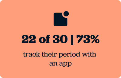
How do you track your period?
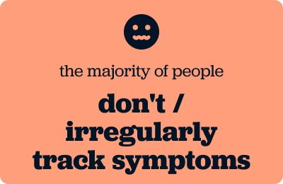
How often do you track symptoms during your cycle?
How likely are you to look for advice and tips from the sources below?
Would you like to share some of your favourite sources with us?
In the past three months, which of the following apps have you used? Let us know which apps you are using to support your wellbeing and hormone health. If the app you are using is not on this list, please share it with us below.
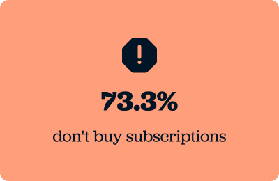
How much do you spend on average per month on subscriptions for cycle and wellbeing apps? Anything from fitness to nutrition to cycle apps.
How do you feel about the following statement? Keeping track of our cycles and learning about our bodies and hormones allows us to actively improve our wellbeing and take back control.
Age range: 25-44
Participants: 30 responses | 1 invalid
Distribution: Survey was shared via Slack, Whatsapp & Linkedin with a Survey
Here are some key insights from the survey.


USER INTERVIEWS
Listening to people's stories
The outcomes of the survey led me to more questions:
Why did people rarely track their symptoms?
How do people establish healthy habits?
What did people like or dislike about the apps they use to track their periods?
Why do people not want to pay for subscriptions?
So, I invited women to ask about their needs, opinions and frustrations. I felt honoured by how openly participants talked about this sensitive topic and shared their experiences.
A screenshot of me during an interview with a participant
-
What does your day to day look like?
How would you describe your lifestyle?
How do you feel about the topic of hormone health?
How familiar are you with hormone health and any wellbeing trends related to your cycle?
When you read about cycle phases or hormone health, do you want to understand the topic deeply or are you looking for quick solutions? Why?
What methods have worked for you dealing with any symptoms related to your cycle?
Have you been successful in creating a healthy habit? If so, how did you succeed?
How do you keep track of your cycle and symptoms?
What motivates you to track your cycle and symptoms?
What keeps you from tracking your cycle and in particular symptoms?
What app do you use related to your cycle?
What functions do you truly enjoy? Why do you enjoy them?
What frustrates you when using the app? Why does it frustrate you?
Have you paid for a subscription of this app? Why or why not?
What are your concerns about entering sensitive data into an app?
Sessions: 20-30 minutes
Participants: 5 - female, age range 25 - 45
Methodology: Moderated Remote
This is what some people said
"I want to understand a topic deeply, so that I can verify that the solutions I find are valid"
"I don't pay for subscriptions because I don't feel the need right now, my symptoms are not that bad"
"I only really started paying attention to hormones and my cycle phases in the past two years"
AFFINITY DIAGRAM
The people I interviewed were using apps less than expected and didn't know much about hormone health. I felt conflicted. I wanted to go deeper, but I needed more time and resources. I consulted my mentor and decided to move on instead of chasing perfection.
Once I started clustering the information into themes and identified the pain points and needs of people, I realised that I had a lot of significant findings to work with.
Affinity diagram in which I clustered all my insights into patterns
CHALLENGE REFLECTION
The light bulb moment, understanding my users
I learned that hormone health was not as important in people's minds as I had thought. Even though some may have symptoms, they only start paying attention if they have a severe health scare themselves or in their family. This outcome was disappointing initially; however, I realised it didn't mean I wasn't onto something.
Some more Participant Quotes from the interviews
“I want to have a quick solution.”
“I mainly research when there is a problem, without issues I don’t really look things up.”
“There is still a lot of education I can do, I have a basic knowledge of what it means to be a female.”
“Balancing hormones is everything”
Key insights from survey and interviews
People either use a simple app or their own calendar to track their cycle
People investigate when there are symptoms or issues
Healthy habits come and go, people struggle to keep up
Now it all made sense!
➔ Most people wanted to improve their well-being, but life was getting in the way.
➔ Some people loved learning about their bodies, while others wanted to find quick solutions.
➔ Simplicity was important to most people.
USER PERSONAS
Changing my point of view
Based on these insights, I created two personas to stay connected with my core users:
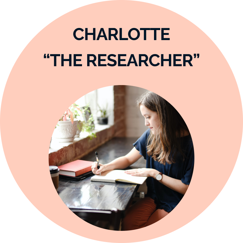
Charlotte, who wants to understand her body, and
Kathy, who wants a quick fix for her issues.
What do they have in common? A busy lifestyle and the desire to improve their well-being.

USER JOURNEY MAPS
I imagined a day in the life of the personas through user journey maps that outline their thought process and the emotions they are going through when, for example, they need to figure out in what cycle phase they are or look up information about symptoms.
IDEATION
Coming up with ideas
My research findings, the personas and user journey maps showed me what features could be helpful, and I started brainstorming ideas.
I decided to pursue
A dashboard that shows in which cycle phase the user is and displays short, simple well-being methods in a daily routine. Users can see bite-sized information at one glance and don't have to think about what they could do to feel good.
A period log that, based on my research, needed to be easy, so I decided to make this possible with a button that people can access on every screen in the app.
A search and education section that enables users to look for solutions to their issues and learn about their bodies.
I like to write down all my ideas into a notebook, which helps me to get a better overview and out of my head
USER FLOWS
Ensuring a smooth and easy flow
As these ideas had the most value for my users, I developed user flows for these solutions to understand what people needed, e.g. to track their periods.
SITEMAP
Creating a structure that makes sense
I thought about the app's structure and drafted a sitemap to arrange the content. To ensure that people would find what they were looking for and where they would expect it, I conducted a card sorting where I asked people to sort my app's content into categories. The result helped me to simplify and improve the information architecture. View Sitemap
WIREFRAMES
Visualising the first wireframes
With the structure in place, I visualised my ideas through quick sketches, trying different layouts. I got inspiration from other apps and took into consideration existing design patterns as well as usability standards.
My solutions focus on giving high-level information relevant to both personas with the possibility of diving deeper, for example, into articles when needed.
Sketches of the dashboard, where a user can click on an insight and gets to an article with the possibility to save it for later.
USABILITY TEST
Testing the ideas ideas
I created a mid-fidelity prototype to test my ideas with real people, as I didn't have a visual identity yet. Overall, the feedback was very positive. However, some users had trouble finding the search option and got confused by multiple ways to track the period. Additionally, some users felt the message displayed after entering symptoms was not sensitive enough.
Screenshot from a usability testing session
The “Rainbow Spreadsheet” that I used to analyse my tests
To address these issues,
➔ I removed the extra button,
➔ moved the search option into the education section, and
➔ replaced the message with a more compassionate statement.
I then validated these improvements with an additional test.
The testing sessions helped me identify issues I had overlooked and tailored my designs to the needs and expectations of the target audience.
STYLE GUIDE
Telling the visual story
I opted for a soft colour scheme of teal, salmon, and lilac to connect emotionally with my user group. These colours evoke tranquillity, health, and femininity, creating a calm environment where people can take a deep breath. Two weeks into the project, I brainstormed ideas for a name and finally decided on "nava". The name translates to "Beautiful", "New", and "Melody" in different languages and cultures.
The style guide
Results and Impact
Once I completed the high-fidelity prototype, I asked UX peers for feedback. The feedback was invaluable and pushed the quality of my designs even further.
It is all coming together in the final prototype.
Main challenge and lesson learnt
My heart and soul went into this project, and I am proud of my first End-to-End design project and raising awareness for a cause I deeply care about. I received positive feedback from the UX Design community.
I learned that neither research nor the design thinking process is perfect and that I need to get comfortable with the unknown.
Moving forward, I will do my best to listen to my instinct when it tells me to dig deeper and learn more about my users.
I will also spend more time in the ideation and rapid prototyping phase to push my creativity!
Next Steps
Hypothetically speaking, I'd like to monitor sign-ups, retention and conversion metrics after developing and shipping the app. I'd also love to explore other hypotheses, for example, if people want more personalisation or a learning feature.
Connecting students to drive collaboration & support
The student community hub roots, a responsive web app
Want to work with me?
⁓
Want to work with me? ⁓
Let’s connect!